
How to Actually Read a Nutrition Label in a Way That Changes Your Choices
Serving size, added sugars, sodium, fiber, and the ingredient list reveal more than any front-of-pack claim, and a simple side-by-side comparison turns them into better choices.
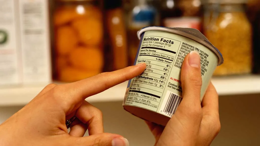
A shopper in the cereal aisle faces a dozen boxes, each promising some version of health. Many of those promises are marketing language rather than measurement, and the Nutrition Facts panel on the side is the only part of the package built to be compared across products.
Reading a nutrition label effectively means checking five things in order: the serving size, the added sugars, the sodium, the fiber, and the ingredient list.
Trending Now!!:
Percent Daily Value turns grams into context, with 5 percent or less counting as low and 20 percent or more as high.
Start With the Serving Size, Because Every Other Number Depends on It
Serving size is the most overlooked line on the panel and the one most often responsible for misreadings. It reflects the amount people typically eat in one sitting, not an amount anyone recommends. Every calorie, gram, and percentage below it is calculated from that figure.
The most recent overhaul of the label, which large manufacturers had to adopt by January 2020, adjusted serving sizes to match real eating habits. Ice cream moved from half a cup to two-thirds of a cup, and the numbers beneath it rose in proportion. The same revision introduced dual-column labels on larger packages, showing nutrition per serving and per container.
The practical habit is simple: compare the serving size to what is actually going to be eaten, then multiply. A bag of crisps that looks like a single portion may list two servings, and a pint of ice cream may list four. A shopper who eats the whole container is consuming double or quadruple every number printed on the first line.




Use Percent Daily Value as a Speed Tool
Percent Daily Value, written as %DV, shows how much one serving contributes to a full day’s intake, based on a 2,000-calorie diet. Dietitians often teach the 5 and 20 rule: 5 percent or less is low, 20 percent or more is high.
The rule works best when it is applied in the right direction. Saturated fat, sodium, and added sugars are nutrients to keep toward the low end. Fiber, vitamin D, calcium, iron, and potassium are nutrients to push toward the high end. A pasta dish with 1,150 mg of sodium delivers 50 percent of the 2,300 mg daily value in one serving, which is a loud signal that the dish is high in sodium.
The percentages carry limits worth knowing. They assume a 2,000-calorie day, so a smaller or more active person will read them differently.
The sodium value of 2,300 mg is a ceiling, and critics, including the Center for Science in the Public Interest, argued during the last revision that a lower figure of 1,500 mg would have been more protective. Harvard’s nutrition faculty similarly noted that the limit is probably still high for many people. The percentages are a reference frame, not a prescription.
Added Sugars: The Line That Rewrote the Label
The addition of an added sugars line was the most consequential change to the panel since it debuted in 1994. Total sugars include the lactose in milk and the fructose in whole fruit. Added sugars are the ones introduced during processing, including table sugar, syrups, honey, and concentrated fruit juice.
The daily value for added sugars is 50 grams, roughly 12 teaspoons, which corresponds to 10 percent of calories on a 2,000-calorie diet. Total sugars have no daily value because no health authority has set a recommended limit for them. This matters when comparing foods that look similar. Plain yogurt may show 6 grams of total sugar and no added sugar, while a flavored version shows 14 grams of total sugar with 8 grams added.
Before the change, shoppers had to infer added sugar by scanning the ingredient list. The Center for Science in the Public Interest projected that a 20-ounce cola would show about 130 percent of the daily limit in a single bottle. That kind of number changes behavior in a way that a gram count never did.
Sodium: Where the Number Hides
Average sodium intake in the United States has been estimated at roughly 3,400 mg per day, well above the 2,300 mg reference. Most of it comes from packaged and restaurant food rather than the salt shaker, which is why the panel is the right place to catch it.
Sodium accumulates in foods that do not taste salty. Bread, breakfast cereal, canned soup, deli meat, pasta sauce, and frozen meals routinely contribute 10 to 30 percent of the daily value per serving. A working heuristic used by many dietitians is to look for products where sodium in milligrams is roughly equal to or lower than the calories per serving. This is not an official standard, but it filters out the heaviest offenders quickly.
Comparison within a category beats absolute targets. Two jars of tomato sauce can differ by several hundred milligrams per serving, and the lower one is usually available at a similar price.
Fiber, Protein, and the Satiety Math
Fiber has a daily value of 28 grams. Under the 5 and 20 rule, 5 grams or more per serving counts as a high source, which makes it a useful screen for breads, cereals, and snack bars. Fiber slows digestion and supports fullness, so a product high in fiber and moderate in added sugar behaves differently in the body than a low-fiber product with the same calories.
Protein is listed in grams, and most products carry no percentage because a daily value is only required in specific cases. Comparing protein grams per hundred calories is a more honest metric than the large numbers printed on the front of a bar.
Fat deserves a more nuanced reading than it once did. The old line for calories from fat was dropped in the redesign, reflecting the shift in nutrition science from total fat to fat quality. Saturated fat remains the line to watch, and the type of fat in the ingredient list tells more than the total.
Read the Ingredient List as the Second Opinion
The Nutrition Facts panel quantifies, and the ingredient list explains. Ingredients are listed in descending order by weight, so the first three items make up the bulk of the product. A granola with oats first and cane sugar, brown rice syrup, and honey scattered further down may contain more sugar by weight than oats, because each sugar is listed separately.
Several sugar names signal added sweeteners: dextrose, maltose, rice syrup, agave, and fruit juice concentrate. A “whole grain” claim on the front should be confirmed by seeing a whole grain as the first ingredient, not an enriched flour with a small proportion of whole grain added.
Terms such as “net carbs” appear on many keto and low-carb products but are not defined by the FDA, so the figure depends entirely on the manufacturer’s own method of subtracting fiber and sugar alcohols. Sugar alcohols such as erythritol and maltitol are listed under carbohydrates and can affect digestion and blood sugar in different ways.
What Front-of-Package Claims Do and Do Not Mean
Front-of-package language is where most misleading decisions begin. In December 2024 the FDA published a final rule redefining the word “healthy” on food labels, the first update to that standard since 1994.
The new criteria rely on food group equivalents and set limits on added sugars, sodium, and saturated fat, so nutrient-dense foods such as fruits, vegetables, and plain whole grains qualify, while some products that used the claim under the old rule no longer will. Manufacturers have a multi-year window to comply, which means older packaging will remain on shelves for some time.
The FDA also proposed in January 2025 a standardized “Nutrition Info” box for the front of most packaged foods. It would rate saturated fat, sodium, and added sugars as low, medium, or high, with a compliance period of three years after a final rule for larger companies and four years for smaller ones. Readers should check the FDA’s website for the current status of that rule, since a proposal is not the same as a requirement.
Until a standard front-of-package system exists, the claims split into two groups. Defined terms such as “low sodium” and “no added sugars” carry regulatory meaning. Terms such as “natural” and “wholesome” carry far less, and the panel on the side remains the arbiter.
A 10-Second Comparison Routine
The most reliable way to apply all of this is to compare two similar products rather than evaluate one in isolation. Check the serving size and confirm it matches the portion you’ll eat.
Check added sugars and sodium first, then fiber. Scan the first three ingredients. The product with lower added sugar, lower sodium, and higher fiber per realistic serving is usually the better choice, and the entire check takes less time than reading the front of the box.
Where Labels Fall Short
The panel is a tool, not a verdict. It does not capture how heavily a food has been processed, how it affects satiety, or how it fits into a broader eating pattern. A food with a clean panel can still be an ultra-processed product, and a food with a modest panel, such as olive oil or nuts, can be among the most useful items in a kitchen.
People managing diabetes, hypertension, kidney disease, or food allergies need individualized targets that the 2,000-calorie reference cannot provide, and a registered dietitian is the right source for those. The rules described here also apply to labels in the United States. The United Kingdom uses a voluntary traffic-light system on the front of packs, and requirements differ across other regions, so the layout of the panel may differ even where the logic holds.
Read well, a label is a comparison engine. Its value comes from checking the same five lines across competing products, and the habit, repeated over a few weeks of shopping, tends to shift choices more than any single rule about what to avoid.
What People Ask