
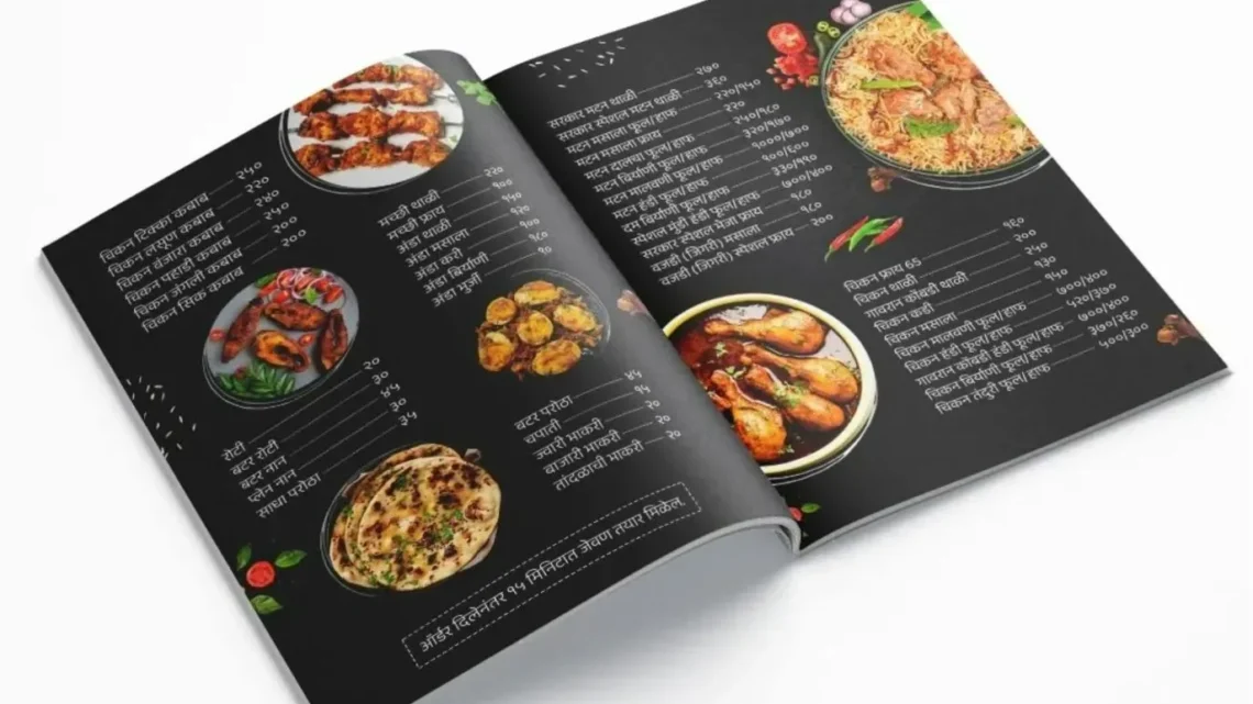
How Restaurant Menus Are Designed to Make You Spend More
From price formats to decoy dishes, menu engineering quietly shapes what diners order, and the research behind the tactics is less settled than the folklore suggests.
A menu is the one salesperson every guest meets, and it never has an off night. Long before a server arrives, layout, wording and price formatting have already begun steering what the table will order.
Restaurant menus raise spending through a mix of layout, language and pricing psychology: removing currency symbols, anchoring diners with a costly decoy dish, placing high-margin items where eyes land, and describing dishes in sensory detail. Each tactic nudges attention and perceived value rather than forcing a choice.
Trending Now!!:
The practice has a name, menu engineering, and an entire consulting industry behind it. Some of its best-known claims hold up under scrutiny. Others have circulated for years on little more than repetition.
Menu Engineering Starts With a Spreadsheet
The discipline is older than most diners assume. In 1982, Michael Kasavana and Donald Smith of Michigan State University proposed sorting every dish by two measures: how often it sells and how much money each sale leaves after ingredient costs.
The resulting categories became trade vocabulary. Stars sell often and earn well. Plowhorses sell often but earn little. Puzzles earn well but sell slowly. Dogs do neither.
Design follows from that classification. A Plowhorse, such as a burger that guests love and that carries a thin margin, may be repriced or repositioned. A Puzzle, such as a high-margin braise that nobody notices, may be given a box, a better description or a more prominent position. A Dog may be removed.




Modern point-of-sale systems have made the exercise routine. Item-level sales data, food cost percentage and contribution margin sit in the same dashboard, so operators can re-score a menu after every quarter.
Many operators still treat a food cost of roughly 28 to 35 percent of menu price as a working benchmark, though the right figure varies widely by concept, and the framework matters more than any single target. A menu that fails on item economics cannot be rescued by a clever font.
A Working Model: Attention, Anchoring, Anguish
Nearly every tactic in the trade pulls one of three levers. The first is attention: which dishes the eye finds and how long it stays.
The second is anchoring: how surrounding prices shape the sense of what a dish is worth. The third is anguish: how much the menu reminds the guest that spending money hurts. The sections below follow that sequence.
Reducing the Pain of Paying
The most cited experiment in the field came from Cornell University’s hospitality school. Researchers led by Sybil Yang and Sheryl Kimes presented the same lunch menu in three formats to 201 diners at the Culinary Institute of America’s St. Andrews restaurant: prices with a dollar sign, prices as bare numerals, and prices spelled out in words.
Guests given the bare numerals spent an average of $5.55 more than the other two groups, which did not differ from each other. The authors suggested that repeated exposure to the word “dollars” or the symbol acts as a prime that activates thoughts of cost, the so-called “pain of paying.”
The study deserves a caveat. It covered one restaurant and one set of menus, and the effect has not been shown to apply to every cuisine or price point. Even so, the finding changed trade practice, and bare numerals now appear on menus from neighborhood bistros to hotel dining rooms.
Gregg Rapp, a Palm Springs menu engineer who has worked with large chains, adds a layout rule that diners rarely notice. Prices aligned in a right-hand column invite guests to scan down and pick the cheapest line. Prices tucked at the end of each description force the guest to read about honey-glazed pork before learning what it costs.
Rapp has also argued that prices ending in .95 feel friendlier than those ending in .99, which he considers the more transparent signal of a discount. The broader literature on left-digit bias explains why endings below a round number work at all: the first digit dominates perception, so $9.95 registers as nine-something rather than ten.
Anchors, Decoys and the Middle Path
Menus also manage value perception by controlling what a dish is compared against. In a widely taught experiment, behavioral economist Dan Ariely offered subscription options to The Economist: web-only, print-only at a price identical to a print-plus-web bundle, and the bundle itself.
The print-only option was a decoy, and almost no one chose it. Its presence still pushed the large majority of respondents toward the bundle, whereas without it most had picked the cheaper web-only plan.
Restaurants apply the same logic with a very expensive steak, a market-price lobster or a four-figure bottle. The expensive item makes the dish beside it seem moderate. Three-tier structures, with a small, medium and large version of a dish or a trio of wines by the glass, tend to steer cautious guests to the center.
The standard account calls these items decoys that nobody intends to sell, and the account is incomplete. A premium dish that sells even a few times a week can carry a meaningful share of profit, and diners on expense accounts or celebrating occasions often buy it deliberately. The anchor works either way, which is why experienced operators treat the top of the price range as an asset rather than as set dressing.
Where the Eye Goes, and Where the Myth Begins
The most repeated claim in menu design is the “golden triangle,” the idea that gaze lands first at the center of a menu, then the upper right, then the upper left. Rapp has said that his eye-tracking work shows hotspots in the upper right of a menu held in the hand, and trade writing treats the upper right of a two-panel menu as premium space.
The evidence is more contested than the folklore suggests. Eye-tracking research associated with Cornell found that diners tended to read menus in a manner closer to a page than to a triangle, and critics point out that the diagrams were drawn for print layouts that many guests no longer use.
Eye-tracking commentary on digital menus reports that attention follows scroll position and category order more than any fixed geometry. A Texas A&M project for a barbecue restaurant reportedly lifted profit after high-margin items were moved to the upper right of the board, though that figure comes from a research vendor’s account and has not been independently replicated in the sources reviewed.
The defensible conclusion is narrower than the myth. Position matters, boxes and call-outs draw attention, and the first and last entries in a list are better remembered than the middle ones. A fixed triangle that works on every menu has not been established. Operators who care about results test their own layouts rather than assuming a rule.
Time is also short. A Gallup figure widely repeated in trade coverage puts the average read of an unfamiliar menu at about 109 seconds. Whatever the exact number, guests decide quickly, and a menu that makes the profitable choice easy to find has a structural advantage.
Words That Sell
Language is the second great lever. A frequently quoted field study from the Cornell Food and Brand Lab, led by Brian Wansink, reported that cafeteria items with descriptive names such as “Succulent Italian Seafood Filet” sold 27 percent more than plain equivalents, and that guests rated them higher for quality and value. The labels fell into geographic, nostalgic, sensory and brand categories.
That figure has become one of the most repeated statistics in restaurant marketing and one of the least secure. Wansink later resigned from Cornell after a misconduct finding and multiple retractions of other papers, and analysts who audit menu statistics now flag the 27 percent number as resting on a single study from a compromised source. The direction of the effect is plausible and consistent with practitioner experience. The size is not reliable, and no operator should plan revenue around it.
The practical craft is better documented than the statistics. Rapp’s guidance is to write about flavors and tastes: farm-fresh eggs scrambled in butter sell a different expectation than scrambled eggs. Words that signal popularity or provenance, such as “Chef’s Recommendation” or “House Specialty,” steer attention toward chosen dishes.
The same Cornell work found that guests liked descriptive items more but did not pay higher prices for them, and it warned operators against inflating expectations the kitchen cannot meet. Over-promising on paper produces disappointed diners and weak repeat business.
Photography follows a similar pattern. Rapp has warned that a vivid picture lets the brain taste the dish in advance, so reality can disappoint. No independent controlled study the sources reviewed could identify supports a specific sales lift from menu photos, and any percentage quoted in vendor material should be treated as marketing.
Fewer Choices, Better Margins
A long menu looks generous and performs poorly. Rapp’s rule of thumb is that more than seven items per category is too many, five is optimal and three is “magical.” The justification is a mix of kitchen efficiency and decision psychology: shorter menus reduce waste, speed service and make signature dishes stand out.
The psychological claim needs a caution. Research on choice overload, the idea that too many options reduce satisfaction or purchasing, has produced mixed results, and meta-analyses have found the effect inconsistent across settings. The operational case for tighter menus, covering inventory, prep time and consistency, is stronger than the behavioral one.
Digital Menus Rewrite the Rules
QR codes and tablet ordering turned the menu from a document into software. Scroll depth, category order and default selections now matter more than a page diagram.
A high-margin dish buried below the second position in a long digital category may rarely be seen, which raises the stakes of menu audits. Ordering apps and kiosks add prompts for add-ons, upsized portions and tips that a printed card could never present at the moment of purchase.
The same data trail also gives operators something paper never did: item-level evidence. Digital menu platforms and menu engineering software can show which dishes are viewed but not ordered, which is precisely the gap a Puzzle represents. Operators who once relied on instinct can now run controlled tests of wording, position and price.
What Diners Can Do About It
Awareness blunts most of these techniques. Deciding on a rough budget before opening the menu removes the anchor effect. Reading the price last, rather than scanning a column, restores the choice that right-aligned prices undermine.
A boxed dish, a chef’s recommendation or a dish at the top of a list is worth reading with the question of why it was singled out, since the answer is sometimes quality and often margin. Middle options on tiered lists and wine menus are worth comparing against the cheapest tier, because the step up is often the point.
Regulation has narrowed the information gap in one area. In the United States, the Food and Drug Administration’s menu labeling rule requires calorie information on menus at chain restaurants with 20 or more locations, and the requirement has been in force since 2018. Price transparency has no comparable federal standard for restaurant menus, so the burden of attention remains with the guest.
Persuasion or Manipulation
The honest assessment is that most menu engineering is closer to merchandising than deception. A well-organized menu reduces confusion, highlights what a kitchen does best and helps a hesitant diner commit. Retail stores have always arranged shelves with margin in mind, and restaurants do the same with paper and pixels.
The ethical boundary sits where a tactic depends on the guest not knowing something material. Verbal upsells delivered without prices, service charges and fees disclosed only on the final check, and descriptions that promise what the kitchen does not deliver all cross it. Operators who rely on such tactics may lift a single check, but they pay for it in the metric that finances every restaurant: guests who return.
The durable lesson from decades of menu research is modest. Small design choices shift behavior at the margin, and the margin is where restaurants earn their living. A menu cannot make a guest buy something they dislike, though it can make the better-earning dish the easiest one to want.
What People Ask